Horse Racing Part 1
In A Nutshell
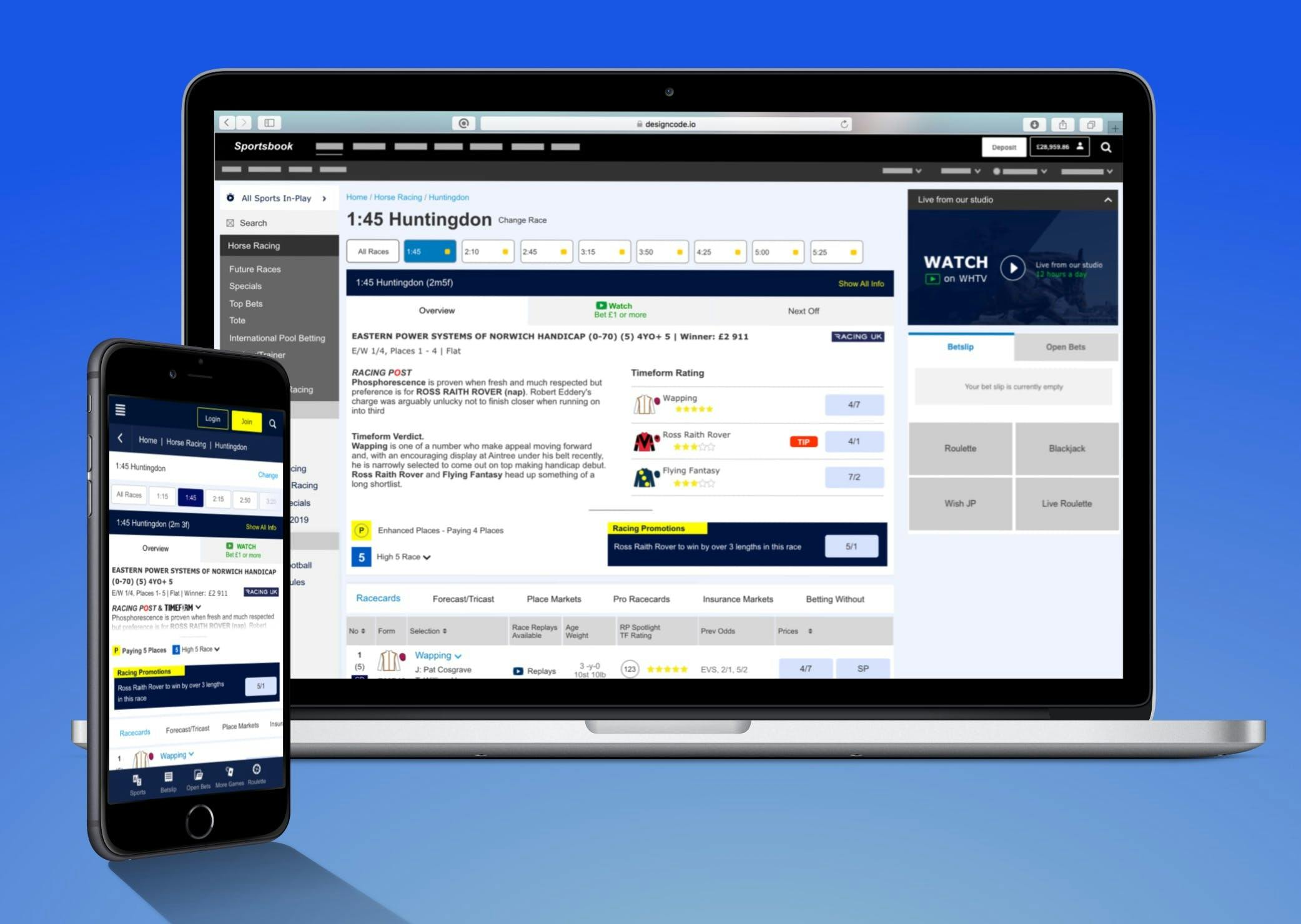
William Hill is a household name - not just in the UK, but across the betting world. They've transitioned to the world of online gambling very successfully, with horse-racing accounting for around £1.4billion of turnover in 2017 alone (and it's very much part of their history).
But in today's highly competitive - and lucrative - world of online betting, William Hill can take for nothing for granted. So when their then Director of Sportsbook (i.e. Head of Betting) challenged the online product team to deliver the 'best horse racing experience on the market', he meant it.
It called for smart user-centred design. It called for a presence to combat the promiscuity of punters with an average of two or three accounts across different bookmakers.
And it called for a willingness to knuckle down to get the job and that's what I did…

Gather Insights
The first stage of the process was to gather customer and business insights.
Customer Insights were gathered through reviewing comments left in our customer feedback tool, conducting a members survey and looking at the feedback that our support team received.
For business insights, we asked our racing trading team to send us their frustrations.

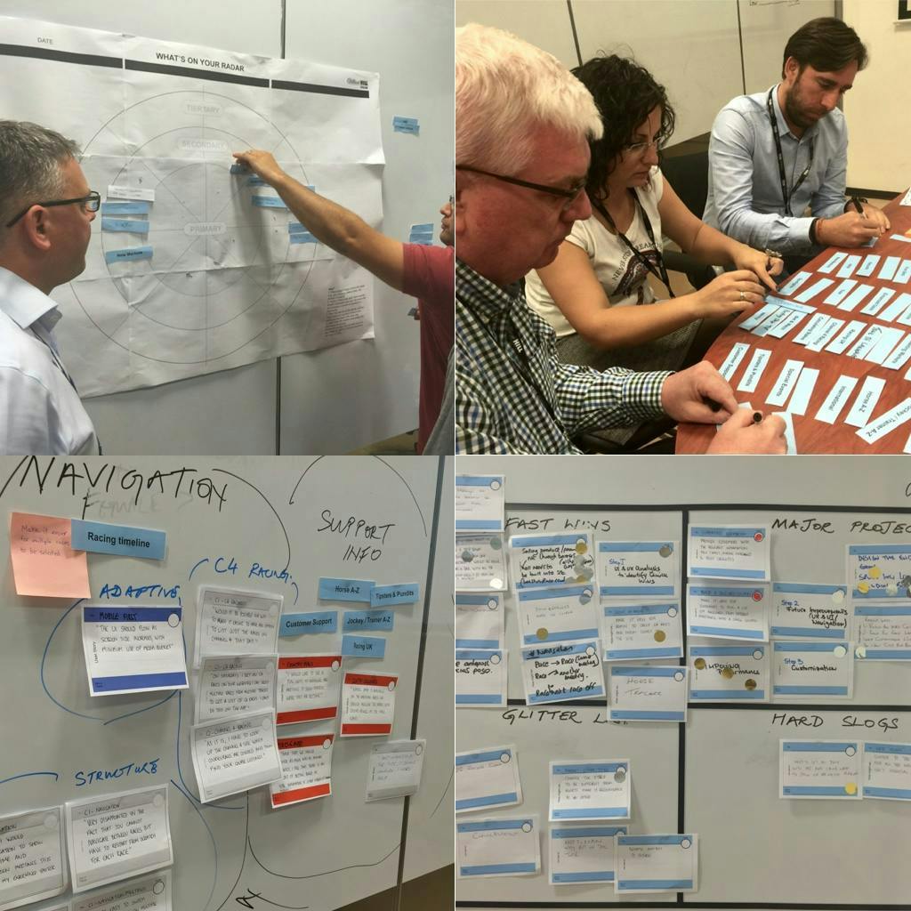
Stakeholder Workshop
Getting stakeholders and Hippo's in a room for a few hours is not an easy task. For this project, we gathered stakeholders into a session.
Using techniques from Pete and I's Lumina Institue training we conducted the workshop in a few hours.
Workshop Techniques
What's on Your Radar - We blocked out the key business goals for this project.
Affinity Clustering - Using the gathered insights above we broke the group into teams and asked them to group the insights into clusters, and put these clusters in the importance of primary, secondary and tertiary importance.
Buy A Feature - We asked the two HIPPO's in the workshop to use gold and silver stickers to call out what their priorities were.
Complexity Matrix - Finally we took the output of the above steps and created a matrix that set out the product owner's roadmap of work for the project.
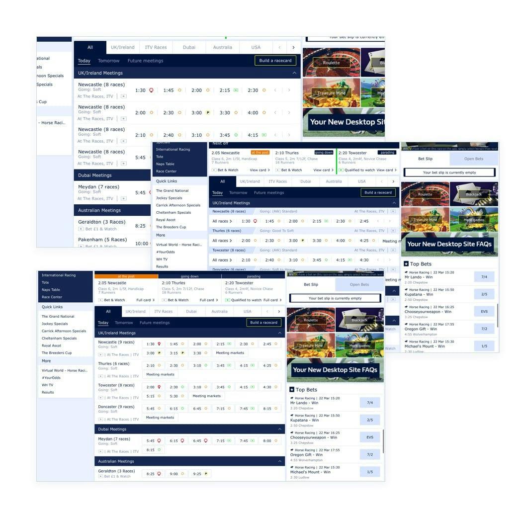
Research And Personas
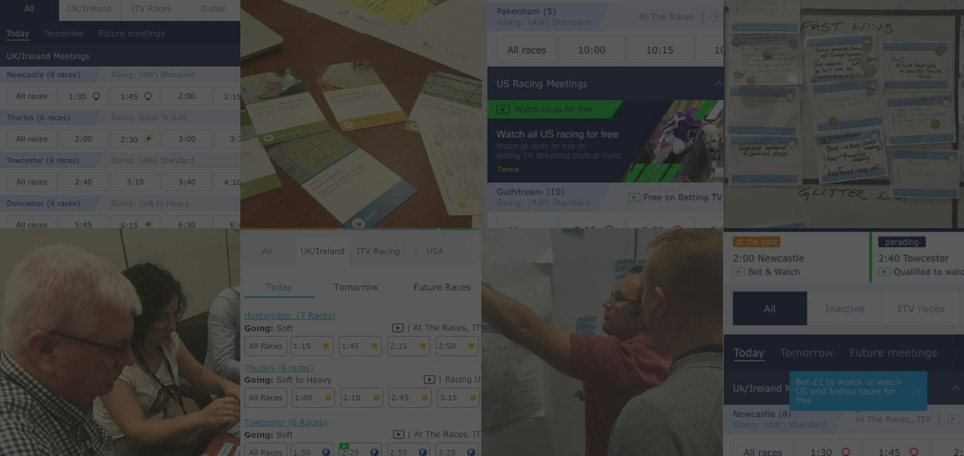
The first page that we had to tackle was the meetings page. We set out to improve two KPI's:
Net Promoter Score through an improved navigation
Increase in turnover via regions outside UK and USA
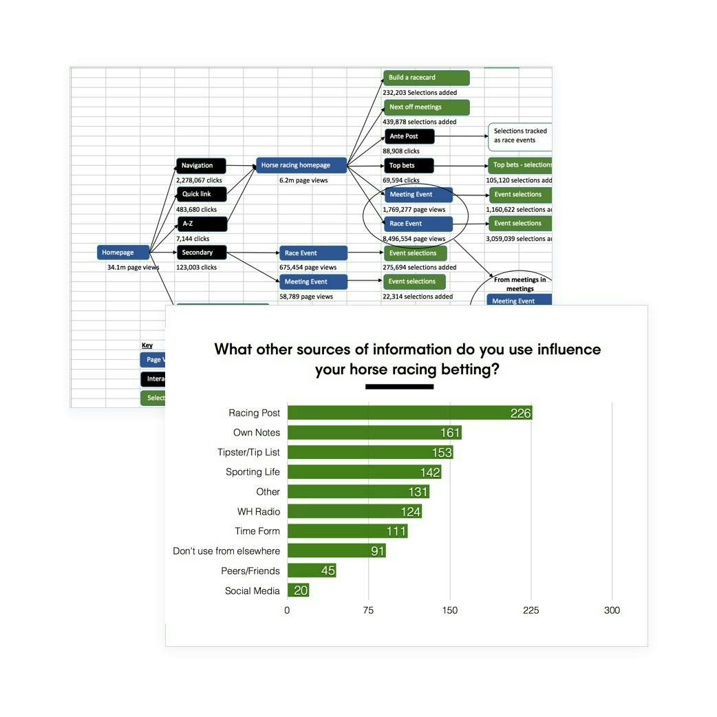
Starting with web analytics we identified the top user goals of the page and again gathered insights into gaps in the page functionality.
The product team wanted to make sure the new page could support the ability to continually provide the appropriate racing over the 23 hour period in a number of countries. This led us to consider a rolling electronic program guide (EPG) of data.
User Testing
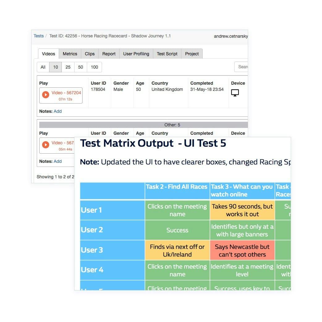
We put a number of wireframes, for both mobile and desktop, through remote user testing using What Users Do (now part of User Zoom).
The wireframes performed well, as stripped back visuals with only links highlighted in colour. It only took two rounds of testing to get the results that we were looking for.
The next step was to move the wireframes through to UI.
When Tests Fail
Moving the designs onwards, I worked with the UI designers to integrate our pattern library and create a more polished UI. We took this high-resolution design back through to further tests in What Users Do.
The high-resolution mockups didn't test as well at all.
Users struggled with large amounts of content, conflicting colour combinations and clashing logic in the pattern library.
The biggest sticking point was the display of race times in the carousel in a scannable, efficient layout.
In the end, it took three rounds of tests to get a design to the point that we were confident would meet all the user needs.
Identifying Personas
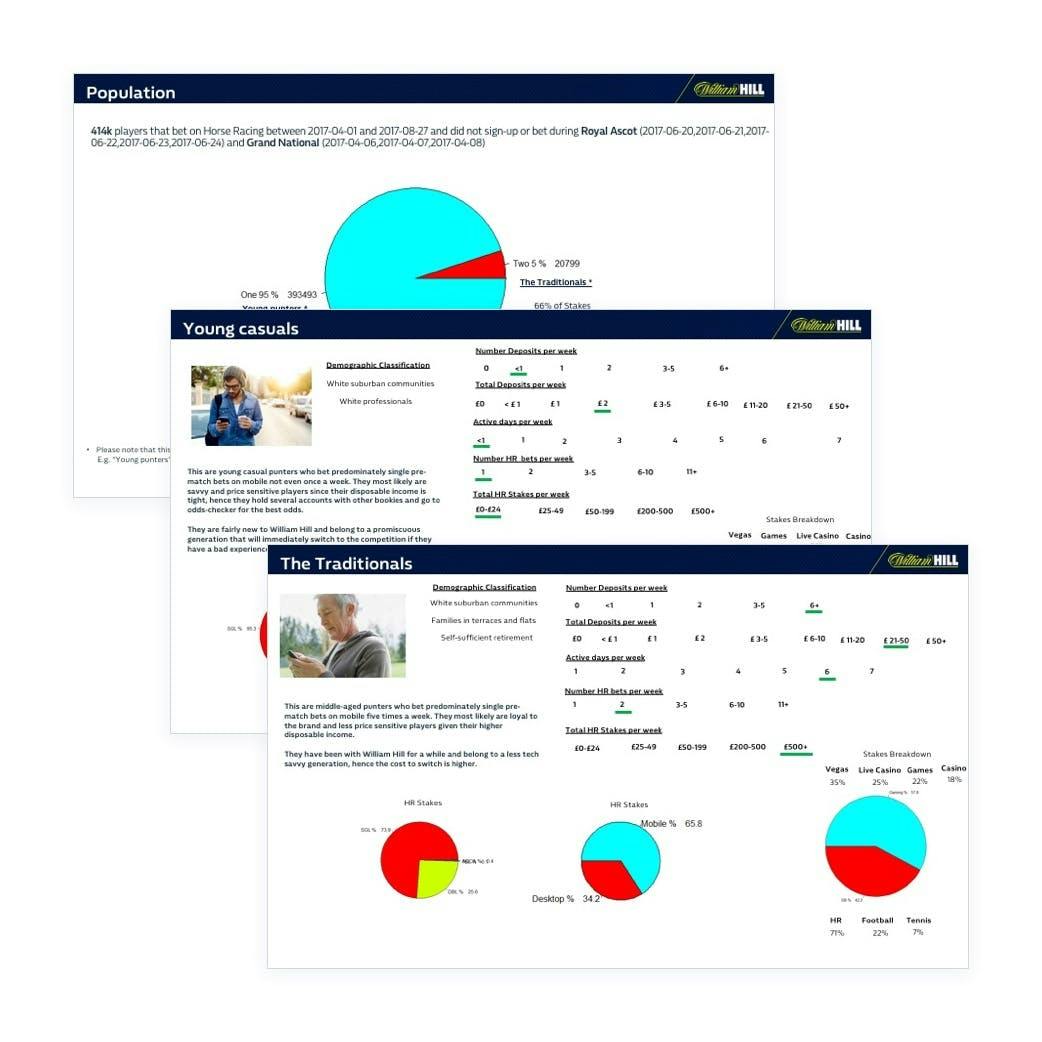
We worked with our intelligence team to identify the personas of our users and it was clear that our older customers should be the focus of our work, being worth four times as much as the younger profile.
This led us to consider our older demographic our main users, and look at ways to educate the younger audience into using the provided information and media to improve their experience.
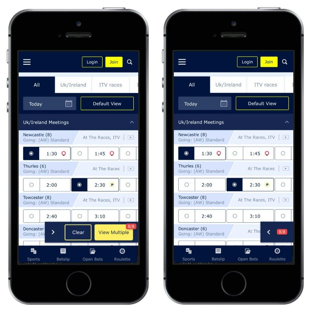
Build A Racecard
A key feature of our racing page is the ability for the user to select races from multiple meetings and countries and build their own racecard.
The feature on our previous pages was poorly implemented and this was a chance to improve it.
User testing told us that users wanted a clear CTA to trigger the function and that the counter of selections to be clearer.
I worked with the UI designer to tidy this up and prepared a Framer JS prototype to demonstrate to the development team. View the Framer Prototype
The Outcome
This project was in development when I left the company and no longer have access to the statistics. However, the page was delivered as designed * and William Hill continues to be a leader in horse racing betting.
You can read more about work on this project in Part 2.
* this link may not open outside the uk.
Concepts
Usability Tests
Iterations
Coffees